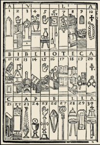
 I am working with a few faculty on campus who are looking to adopt a graphic syllabus. This brief posting is basically a recording of that conversation for online reference. Those who have read this blog for a while know that I have done a lot of work over the years in visual learning and concept maps, and I think that a graphic syllabus is a great way to start the semester. When I hear faculty say “my syllabus is my contract with the students,” I find that the syllabus often looks like a contract. The students immediately tense up and flip through them looking for the button to press to agree to the terms. At the very least, I ask faculty to at least put their picture on the syllabus, maybe for the more adventurous I will ask them to use the school colors and the mascot: this at least connects the syllabus to the college.
Why Can’t We Have a Little Color?
That was the best question I got from an instructor who is concerned about what message the learning materials give new students. How much more welcoming can we make the syllabus? We are doing a lot with the syllabus at Clover Park Technical College. We are exploring was to change how we think of the syllabus and the language we use in it to address diversity, equity and inclusion issues. This, of course, is long overdue. The culture that created the syllabus and the students who read them (when they do) has long since changed. We are also attending to things like accessibility and student support. The syllabus is an opportunity to connect students to everything they need to be successful in a class and in college. So the interest in a graphic syllabus is in alignment with needed changes that we have been wanting to make anyway.
What Story Does Your Syllabus Tell?
Syllabus will be remembered if it is telling a story or is invested in a metaphor (a “treasure map” for instance). We use visual metaphors as mnemonic devices. All of the reasons that we use concept maps also work for why we should be using a graphic syllabus – it helps students order and remember the information.
According to the University of Texas at Austin’s CTL, the graphic syllabus can help you rethink the story your syllabus communicates to your students. In addition to focusing on the big picture, this is your chance to make the text you do use even more meaningful.
- Created effectively, a graphic syllabus tells a story not only about your course, but about you, your enthusiasm for the course, and your expectations for the students.
- Use language that conveys a sense of support for students’ well-being, includinginformation on relevant support resources.
- Think about the tone of your syllabus, the rationale you provide for assignments and policies, and how you encourage enthusiasm for the material
Is It Accessible?
Attending to accessibility is not too difficult here. Often, a graphic syllabus is based on a previous, traditional syllabus. All we need to do is to make sure that the text version is accessible (uses styles like headings, tables use headers, etc.). Somewhere in the top of the syllabus should be a link to the pure text version of the syllabus.
What Tools Should We Use?
One could use any number of tools. I would use the tools that you are most comfortable with including:
- Google (Docs, Slides, etc.)
- MS Word
- PowerPoint – this is a favorite of some faculty because they know how it works and you can save your work as a pdf.
- Piktochart
- Canva
- And many others.
Can You Send Me Some Examples?

- Cambrian College put up some templates that we are interested in because a lot of our faculty are comfortable (or at least more comfortable) using PowerPoint than Adobe products or learning a new platform.
- Chem 100 syllabus reproduced at Memorial University. I like this because a timeline is an element in the graphic.
- The syllabus as a concept map is highlighted here at the University of Rhode Island. This is how I commonly represented my courses graphically.
- Here is the infographic syllabus of an infographic course!
- This example discusses how to use the online tool Canva to build out a syllabus.
If you have favorite examples of graphic syllabi, post them in the comments below or feel free to drop me a note in Mastodon.


